Posts Tagged ‘partial autocorrelation function’

Forecast Friday Topic: Stationarity in Time Series Data

January 13, 2011

(Thirty-fifth in a series)

In last week’s Forecast Friday post, we began our coverage of ARIMA modeling with a discussion of the Autocorrelation Function (ACF). We also learned that in order to generate forecasts from a time series, the series needed to exhibit no trend (either up or down), fluctuate around a constant mean and variance, and have covariances between terms in the series that depended only on the time interval between the terms, and not their absolute locations in the time series. A time series that meets these criteria is said to be stationary. When a time series appears to have a constant mean, then it is said to be stationary in the mean. Similarly, if the variance of the series doesn’t appear to change, then the series is also stationary in the variance.

Stationarity is nothing new in our discussions of time series forecasting. While we may not have discussed it in detail, we did note that the absence of stationarity made moving average methods less accurate for short-term forecasting, which led into our discussion of exponential smoothing. When the time series exhibited a trend, we relied upon double exponential smoothing to adjust for nonstationarity; in our discussions of regression analysis, we ensured stationarity by decomposing the time series (removing the trend, seasonal, cyclical, and irregular components), adding seasonal dummy variables into the model, and lagging the dependent variable. The ACF is another way of detecting seasonality. And that is what we’ll discuss today.

Recall our ACF from last week’s Forecast Friday discussion:

Because there is no discernable pattern, and because the lags pierce the ±1.96 standard error boundaries less than 5% (in fact, zero percent) of the time, this time series is stationary. Let’s do a simple plot of our time series:

A simple eyeballing of the time series plot shows that the series’ mean and variance both seem to hold fairly constant for the duration of the data set. But now let’s take a look at another data set. In the table below, which I snatched from my graduate school forecasting textbook, we have 160 quarterly observations on real gross national product:

160 Quarters of U.S. Real Gross Domestic Product

t

Xt

t

Xt

t

Xt

t

Xt

1

1,148.2

41

1,671.6

81

2,408.6

121

3,233.4

2

1,181.0

42

1,666.8

82

2,406.5

122

3,157.0

3

1,225.3

43

1,668.4

83

2,435.8

123

3,159.1

4

1,260.2

44

1,654.1

84

2,413.8

124

3,199.2

5

1,286.6

45

1,671.3

85

2,478.6

125

3,261.1

6

1,320.4

46

1,692.1

86

2,478.4

126

3,250.2

7

1,349.8

47

1,716.3

87

2,491.1

127

3,264.6

8

1,356.0

48

1,754.9

88

2,491.0

128

3,219.0

9

1,369.2

49

1,777.9

89

2,545.6

129

3,170.4

10

1,365.9

50

1,796.4

90

2,595.1

130

3,179.9

11

1,378.2

51

1,813.1

91

2,622.1

131

3,154.5

12

1,406.8

52

1,810.1

92

2,671.3

132

3,159.3

13

1,431.4

53

1,834.6

93

2,734.0

133

3,186.6

14

1,444.9

54

1,860.0

94

2,741.0

134

3,258.3

15

1,438.2

55

1,892.5

95

2,738.3

135

3,306.4

16

1,426.6

56

1,906.1

96

2,762.8

136

3,365.1

17

1,406.8

57

1,948.7

97

2,747.4

137

3,451.7

18

1,401.2

58

1,965.4

98

2,755.2

138

3,498.0

19

1,418.0

59

1,985.2

99

2,719.3

139

3,520.6

20

1,438.8

60

1,993.7

100

2,695.4

140

3,535.2

21

1,469.6

61

2,036.9

101

2,642.7

141

3,577.5

22

1,485.7

62

2,066.4

102

2,669.6

142

3,599.2

23

1,505.5

63

2,099.3

103

2,714.9

143

3,635.8

24

1,518.7

64

2,147.6

104

2,752.7

144

3,662.4

25

1,515.7

65

2,190.1

105

2,804.4

145

2,721.1

26

1,522.6

66

2,195.8

106

2,816.9

146

3,704.6

27

1,523.7

67

2,218.3

107

2,828.6

147

3,712.4

28

1,540.6

68

2,229.2

108

2,856.8

148

3,733.6

29

1,553.3

69

2,241.8

109

2,896.0

149

3,781.2

30

1,552.4

70

2,255.2

110

2,942.7

150

3,820.3

31

1,561.5

71

2,287.7

111

3,001.8

151

3,858.9

32

1,537.3

72

2,300.6

112

2,994.1

152

3,920.7

33

1,506.1

73

2,327.3

113

3,020.5

153

3,970.2

34

1,514.2

74

2,366.9

114

3,115.9

154

4,005.8

35

1,550.0

75

2,385.3

115

3,142.6

155

4,032.1

36

1,586.7

76

2,383.0

116

3,181.6

156

4,059.3

37

1,606.4

77

2,416.5

117

3,181.7

157

4,095.7

38

1,637.0

78

2,419.8

118

3,178.7

158

4,112.2

39

1,629.5

79

2,433.2

119

3,207.4

159

4,129.7

40

1,643.4

80

2,423.5

120

3,201.3

160

4,133.2

Reprinted from Introductory Business & Economic Forecasting, 2nd Ed., Newbold, P. and Bos, T., Cincinnati, 1994, pp. 362-3.

Let’s plot the series:

As you can see, the series is on a steady, upward climb. The mean of the series appears to be changing, and moving upward; hence the series is likely not stationary. Let’s take a look at the ACF:

Wow! The ACF for the real GDP is in sharp contrast to our random series example above. Notice the lags: they are not cutting off. Each lag is quite strong. And the fact that most of them pierce the ±1.96 standard error line is clearly proof that the series is not white noise. Since the lags in the ACF are declining very slowly, that means that terms in the series are correlated several periods in the past. Because this series is not stationary, we must transform it into a stationary time series so that we can build a model with it.

Removing Nonstationarity: Differencing

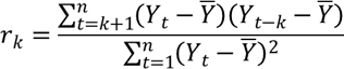
The most common way to remove nonstationarity is to difference the time series. We talked about differencing in our discussion on correcting multicollinearity, and we mentioned quasi-differencing in our discussion on correcting autocorrelation. The concept is the same here. Differencing a series is pretty straightforward. We subtract the first value from the second, the second value from the third, and so forth. Subtracting a period’s value from its immediate subsequent period’s value is called first differencing. The formula for a first difference is given as:


Let’s try it with our series:

When we difference our series, our plot of the differenced data looks like this:

As you can see, the differenced series is much smoother, except towards the end where we have two points where real GDP dropped or increased sharply. The ACF looks much better too:

As you can see, only the first lag breaks through the ±1.96 standard errors line. Since it is only 5% of the lags displayed, we can conclude that the differenced series is stationary.

Second Order Differencing

Sometimes, first differencing doesn’t eliminate all nonstationarity, so a differencing must be performed on the differenced series. This is called second order differencing. Differencing can go on multiple times, but very rarely does an analyst need to go beyond second order differencing to achieve stationarity. The formula for second order differencing is as follows:

We won’t show an example of second order differencing in this post, and it is important to note that second order differencing is not to be confused with second differencing, which is to subtract the value two periods prior to the current period from the value of the current period. 

Seasonal Differencing

Seasonality can greatly affect a time series and make it appear nonstationary. As a result, the data set must be differenced for seasonality, very similar to seasonally adjusting a time series before performing a regression analysis. We will discuss seasonal differencing later in this ARIMA miniseries.

Recap

Before we can generate forecasts upon a time series, we must be sure our data set is stationary. Trend and seasonal components must be removed in order to generate accurate forecasts. We built on last week’s discussion of the autocorrelation function (ACF) to show how it could be used to detect stationarity – or the absence of it. When a data series is not stationary, one of the key ways to remove the nonstationarity is through differencing. The concept behind differencing is not unlike the other methods we’ve used in past discussions on forecasting: seasonal adjustment, seasonal dummy variables, lagging dependent variables, and time series decomposition.

Next Forecast Friday Topic: MA, AR, and ARMA Models

Our discussion of ARIMA models begins to hit critical mass with next week’s discussion on moving average (MA), autoregressive (AR), and autoregressive moving average (ARMA) models. This is where we begin the process of identifying the model to build for a dataset, and how to use the ACF and partial ACF (PACF) to determine whether an MA, AR, or ARMA model is the best fit for the data. That discussion will lay the foundation for our next three Forecast Friday discussions, where we delve deeply into ARIMA models.


*************************

What is your biggest gripe about using data? Tell us in our discussion on Facebook!

Is there a recurring issue about data analysis – or manipulation – that always seems to rear its ugly head?  What issues about data always seem to frustrate you?  What do you do about it?  Readers of Insight Central would love to know.  Join our discussion on Facebook. Simply go to our Facebook page and click on the “Discussion” tab and share your thoughts!   While you’re there, be sure to “Like” Analysights’ Facebook page so that you can always stay on top of the latest insights on marketing research, predictive modeling, and forecasting, and be aware of each new Insight Central post and discussions!  You can even follow us on Twitter!  So get this New Year off right and check us out on Facebook and Twitter!

Forecast Friday Topic: The Autocorrelation Function

January 6, 2011

(Thirty-fourth in a series)

Today, we begin a six-week discussion on the use of Autoregressive Integrated Moving Average (ARIMA) models in forecasting. ARIMA models were popularized by George Box and Gwilym Jenkins in the 1970s, and were traditionally known as Box-Jenkins analysis. The purpose of ARIMA methods is to fit a stochastic (randomly determined) model to a given set of time series data, such that the model can closely approximate the process that is actually generating the data.

There are three main steps in ARIMA methodology: identification, estimation and diagnostic checking, and then application. Before undertaking these steps, however, an analyst must be sure that the time series is stationary. That is, the covariance between any two values of the time series is dependent upon only the time interval between those particular values and not on their absolute location in time.

Determining whether a time series is stationary requires the use of an autocorrelation function (ACF), also called a correlogram, which is the topic of today’s post. Next Thursday, we will go into a full discussion on stationarity and how the ACF is used to determine whether a series is stationary.

Autocorrelation Revisited

Did someone say, “autocorrelation?” Yes! Remember our discussions about detecting and correcting autocorrelation in regression models in our July 29, 2010 and August 5, 2010 Forecast Friday posts? Recall that one of the ways we corrected for autocorrelation was by lagging the dependent variable by one period and then using the lagged variable as an independent variable. Anytime we lag a regression model’s dependent variable and then use it as an independent variable to predict a subsequent period’s dependent variable value, our regression model becomes an autoregressive model.

In regression analysis, we used autoregressive models to correct for autocorrelation. Yet, we can – and have – use the autoregression model to represent the behavior of the time series we’re observing.

When we lag a dependent variable by one period, our model is said to be a first-order autoregressive model. A first-order autoregressive model is denoted as:

Where φ1 is the parameter for the autoregressive term lagged by one period; at is the random variable with a mean of zero and constant variance at time period t; and C is a value that allows for the fact that time series Xt can have a nonzero mean. In fact, you can easily see that this formula mimics a regression equation, with at essentially becoming the residuals of the formula, Xt the dependent variable; C as alpha (or the intercept), and φ1Xt-1 as the independent variable. In essence, a first-order autoregressive model is forecasting the next period’s value on the most recent value.

What if you want to base next period’s forecast on the two most recent values? Then you lag by two periods, and have a second-order autoregressive model, which is denoted by:

In fact, you can use an infinite number of past periods to predict the next period. The formula below shows an autoregressive model of order p, where p is the number of past periods whose values on which you expect to predict the next period’s value:

This review of autocorrelation will help you out in the next session, when we begin to discuss the ACF.

The Autocorrelation Function (ACF)

The ACF is a plot of the autocorrelations between the data points in a time series, and is the key statistic in time series analysis. The ACF is the correlation of the time series with itself, lagged by a certain number of periods. The formula for each lag of an ACF is given by:

Where rk is the autocorrelation at lag k. If k=1, r1 shows the correlation between successive values of Y; if k=2, then r2 would denote the correlation between Y values two periods apart, and so on. Plotting each of these lags gives us our ACF.

Let’s assume we have 48 months of data, as shown in the following table:

Year 1

Year 2

Year 3

Year 4

Month

Value

Month

Value

Month

Value

Month

Value

1

1

13

41

25

18

37

51

2

20

14

63

26

93

38

20

3

31

15

17

27

80

39

65

4

8

16

96

28

36

40

45

5

40

17

68

29

4

41

87

6

41

18

27

30

23

42

68

7

46

19

41

31

81

43

36

8

89

20

17

32

47

44

31

9

72

21

26

33

61

45

79

10

45

22

75

34

27

46

7

11

81

23

63

35

13

47

95

12

93

24

93

36

25

48

37


As decision makers, we want to know whether this data series exhibits a pattern, and the ACF is the means to this end. If no pattern is discerned in this data series, then the series is said to be “white noise.” As you know from our regression analysis discussions our residuals must not exhibit a pattern. Hence, our residuals in regression analysis needed to be white noise. And as you will see in our later discussions on ARIMA methods, the residuals become very important in the estimation and diagnostic checking phase of the ARIMA methodology.

Sampling Distribution of Autocorrelations

Autocorrelations of a white noise series tend to have sampling distributions that are normally distributed, with a mean of zero and a standard error of 1/√n. The standard error is simply the reciprocal of the square root of the sample size. If the autocorrelations are white noise, approximately 95% of the autocorrelation coefficients will fall within two (actually, 1.96) standard errors of the mean; if they don’t, then the series is not white noise and a pattern does indeed exist.

To see if our ACF exhibits a pattern, we look at our individual rk values separately and develop a standard error formula to test whether each value for rk is statistically different from zero. We do this by plotting our ACF:

The ACF is the plot of lags (in blue) for the first 24 months of the series. The dashed red lines are the ±1.96 standard errors. If one or more lags pierce those dashed lines, then the lag(s) is significantly different from zero and the series is not white noise. As you can see, this series is white noise.

Specifically the values for the first six lags are:

Lag Value
r1

0.022

r2

0.098

r3

-0.049

r4

-0.036

r5

0.015

r6

-0.068

Apparently, there is no discernable pattern in the data: successive lags are only minimally correlated; in fact, there’s a higher correlation between lags two intervals apart.

Portmanteau Tests

In the example above, we looked at each individual lag. An alternative to this would be to examine a whole set of rk values, say the first 10 of them (r1 to r10) all at once and then test to see whether the set is significantly different from a zero set. Such a test is known as a portmanteau test, and the two most common are the Box-Pierce test and the Ljung-Box Q* statistic. We will discuss both of them here.

The Box-Pierce Test

Here is the Box-Pierce formula:

Q is the the Box-Pierce test statistic, which we will compare against the χ2 distribution; n is the total number of observations; h is the maximum lag we are considering (24 in the ACF plot).

Essentially, the Box-Pierce test indicates that if residuals are white noise, the Q-statistic follows a χ2 distribution with (h – m) degrees of freedom. If a model is fitted, then m is the number of parameters. However, no model is fitted here, so our m=0. If each rk value is close to zero, then Q will be very small; otherwise, if some rk values are large – either negatively or positively – then Q will be relatively large. We will compare Q to the χ2 distribution, just like any other significance test.

Since we plotted 24 lags, we are interested in only the r2k values for the first 24 observations (not shown). Our Q statistic is:

We have 24 degrees of freedom, and so we compare our Q statistic to the χ2 distribution. Our critical χ2 value for a 1% significance level is 42.98, well above our Q statistic, leading us to conclude that our chosen set of r2k values is not significantly different from a zero set.

The Ljung-Box Q* Statistic

In 1978, Ljung and Box believed there was a closer approximation to the χ2 distribution than the Box-Pierce Q statistic, so they developed the alternative Q* statistic. The formula for the Ljung-Box Q* statistic is:

For our r2k values, that is reflected in:

We get a Q* = 24.92. Comparing this to the same critical χ2 value, our distribution is still not significant. If the data are white noise, then the Q* and Q statistic will both have the same distribution. It’s important to note, however, that portmanteau tests have a tendency to fail in rejecting poorly fit models, so you shouldn’t rely solely on them for accepting models.

The Partial Autocorrelation Coefficient

When we do multiple regression analysis, we are sometimes interested in finding out how much explanatory power one variable has by itself. To do this, we omit the independent variable whose explanatory power we are interested in – or rather, partial out the effects of the other independent variables. We can do similarly in time series analysis, with the use of partial autocorrelations.

Partial autocorrelations measure the degree of association between various lags when the effects of other lags are removed. If the autocorrelation between Yt and Yt-1 is significant, then we will also see a similar significant autocorrelation between Yt-1 and Yt-2, as they are just one period apart. Since both Yt and Yt-2 are both correlated with Yt-1, they are also correlated with each other; so, by removing the effect of Yt-1, we can measure the true correlation between Yt and Yt-2.

A partial autocorrelation coefficient of order k, which is denoted by αk, is determined by regressing the current time series value by its lagged values:

As I mentioned earlier, this form of equation is an autoregressive (AR) one, since its independent variables are time-lagged values of the dependent variable. We use this multiple regression to find the partial autocorrelation αk. If we regress Yt only against Yt-1, then we derive our value for α1. If we regress Yt against both Yt-1 and Yt-2, then we’ll derive values for both α1 and α2.

Then, as we did for the autocorrelation coefficients, we plot our partial autocorrelation coefficients. This plot is called, not surprisingly, a partial autocorrelation function (PACF).

Let’s assume we wanted to measure the partial autocorrelations for the first 12 months of our data series. We generate the following PACF:

Since the lags fall within their 1.96 standard errors, our PACF is also indicative of a white noise series. Also, note that α1 in the PACF is always equal to r1 in the ACF.

Seasonality

Our data series exhibited no pattern, despite its monthly nature. This is unusual for many time series models, especially when you consider retail sales data. Monthly retail sales will exhibit a strong seasonal component, which will show up in your ACF at the time of the seasonal lag. The rk value at that particular lag will manifest itself as a lag that does indeed break through the critical value line, not only at that lag, but at also multiples of that lag. So, if sales are busiest in month 12, you can expect to see ACFs with significant lags at time 12, 24, 36, and so on. You’ll see examples of this in subsequent posts on ARIMA.

Next Forecast Friday Topic: Stationarity of Time Series Data

As mentioned earlier, a time series must be stationary for forecasting.  Next week, you’ll see how the ACF and PCF are used to determine whether a time series exhibits stationarity, as we move on towards our discussion of ARIMA methodology. 

*************************

Start the New Year on the Right Foot: Follow us on Facebook and Twitter !

For the latest insights on marketing research, predictive modeling, and forecasting, be sure to check out Analysights on Facebook and Twitter! “Like-ing” us on Facebook and following us on Twitter will allow you to stay informed of each new Insight Central post published, new information about analytics, discussions Analysights will be hosting, and other opportunities for feedback. So get this New Year off right and check us out on Facebook and Twitter!